


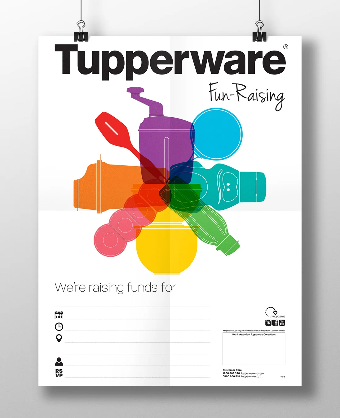

Tupperware presented a unique challenge — it was a historic and well-established company that had never been properly ‘branded’. The bright and vibrant colour palette and graphic language reflects the product range itself and brings consistency to the company’s vast number of communications. This visual language was applied to brochures, catalogues, flyers, stationery, promotional items, packaging, digital communications and fleet signage.